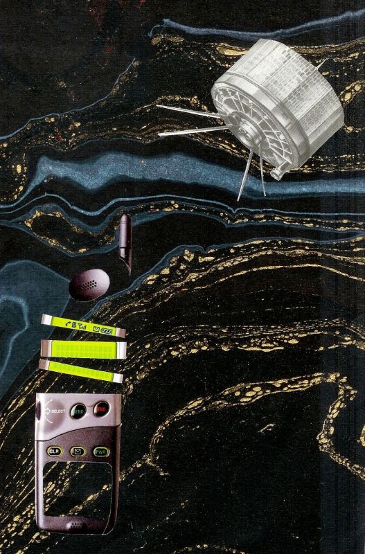
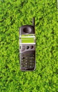
  Here's my "Satellite" illustration for IF and also my "Technology" illustration for Point of Departure. I love it when I can combine two projects! For the Point of Departure I had to make something with this picture of a cell phone. I forgot, AGAIN, to scan the image before I started cutting.
If you can see some faint white lines on the side of my finished image, that is my new scanner problem. After fiddling for an hour with it, I gave up. If anybody knows how to fix this, please let me know. It may just be the end of my old HP scanner. :(
7 Comments
Lisa and I are a bit behind in our Point of Departure project. Below is the picture that she gave me for May. May's theme was "fashion" and I was supposed to make a collage with this picture from an old Eatons Department Store catalogue. 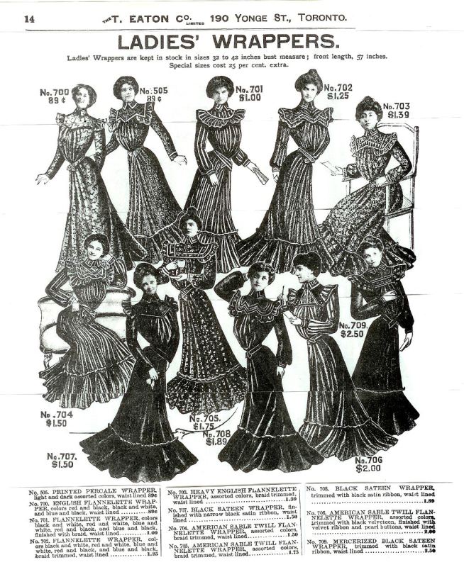 Of course I've seen many pictures of how people dressed a hundred years ago, but I still found the images extremely odd. The women seem to be bent at the waist. They look a little deformed and I found the ad somewhat creepy. I'm so glad we don't have to wear uncomfortable clothes these days. However, lots of people do anyways so maybe not much has changed. I felt an overwhelming desire to cut this picture up and it was almost too late to scan it. I did manage to reassemble it so you could see it. 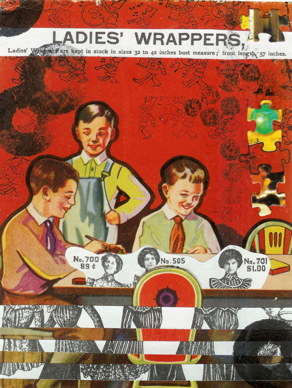 I found these little boys on the back cover of an old book about crafts for boys. It was also a little creepy because two of the boys have little black moustaches. I didn't do that! Maybe some little boy who didn't like crafts did!!
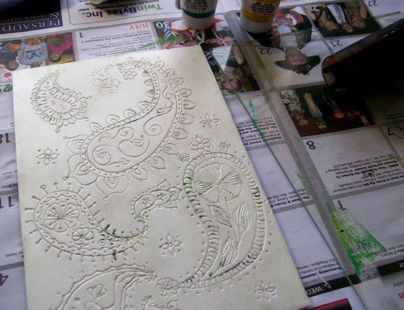 For the "paisley" IF, I decided to try out a particularly nice piece of styrofoam that I'd been saving. I used a pencil to imprint the design and then Speedball printing ink. I printed on various types of paper. I'm not sure what I'll do with them, but I liked the results. Which one do you like best? You can click them if you want to enlarge them. 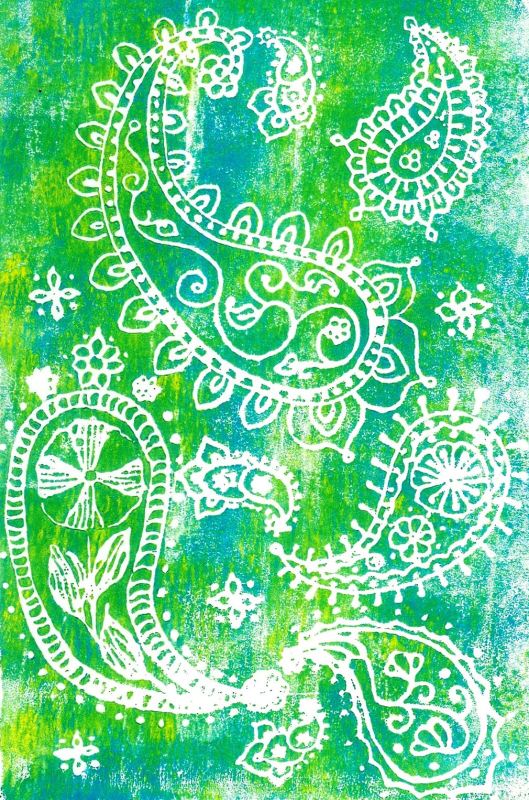 paisley on hot press watercolor paper 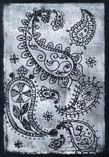 paisley on bristol board 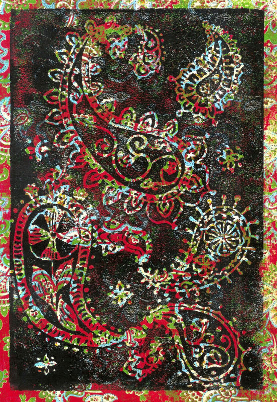 paisley on paisley paper!  paisley on old dictionary page |
 [email protected]  © Laurel Martin 2010
|
 RSS Feed