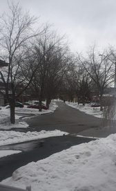
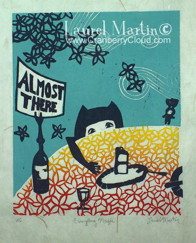
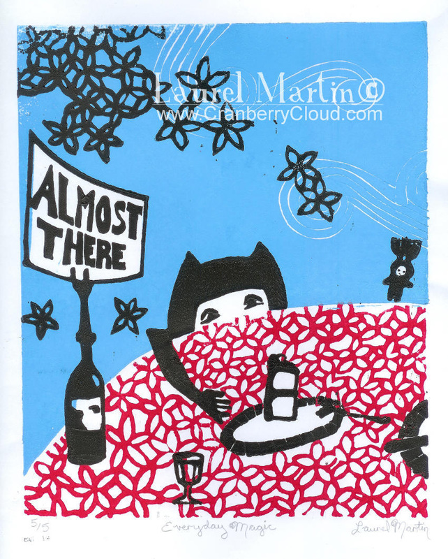
 This is the view from my front door today. If you're a great fan of grey and neutral tones you may appreciate this. I however, need some colour therapy to cope with winter. I don't really mind the cold so much as the lack of colour. I'm sure I could learn a lot from the stark shapes and negative spaces of a Canadian winter, but I'd rather look at really bright mittens and scarves. Thankfully the bus I drive is bright yellow. Have you noticed how much more colour there is when the sun shines? To combat the weather, I've been hiding in my basement printmaking. I've reprinted "Everyday Magic" on brown stonehenge paper and a steel blue Japanese Tatami paper. Which colour combination do you like best? I've also finished another new print and I'm just waiting for it to dry before photographing it. More colour on the way! “Colour is a power which directly influences the soul.” ~Wassily Kandinsky It's true. Colour is the best medicine....that and getting out for a little exercise once in a while, but colour is much more fun!
3 Comments
Kim
3/23/2014 06:01:04 am
I am NOT a fan of grey tones - lol! You know I love your colors. It is so interesting what a difference the paper makes. I can't say I like one more than the other, but today I do love those warms in the Stonehenge print. yum.
Reply
Ann Mackay
3/24/2014 08:04:52 am
I love the print on the Stonehenge paper - it makes the yellows and oranges really glow. But they're all beautiful!
Reply
Laurel
3/24/2014 11:05:36 pm
Thanks Kim and Ann! I think I like the Stonehenge one too, it is the warmest : D
Reply
Leave a Reply. |
[email protected] © Laurel Martin 2010
|


 RSS Feed