|
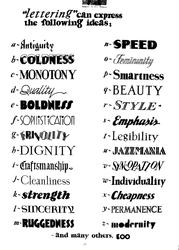
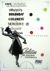
On the last day of March I have finished my POD project. This was a tough one. This month's theme was typography and Lisa gave me the most typography-ist piece of typography I have ever seen! Have a look below. Words are symbols to which we ascribe meaning and typography is supposed to emphasize that meaning. In fact, print on a page is really just little squiggles and our remarkable brains read meaning into them. Our brains love to read meaning into things and to do so they look for patterns. Anywhere the brain finds a pattern it recognizes, it sees meaning. Different people see different patterns and find different meanings. This is the idea I was playing with when I created my piece. I must say that I had some problems as I looked at the words as pictures and then as symbols. The two did not want to reconcile. However, that is what typography is all about: reconciling how words looks visually and what they mean. Click the pictures to enlarge
0 Comments
Leave a Reply. |
[email protected] © Laurel Martin 2010
|


 RSS Feed